Data Grid
Whether you are looking up documents, distributions, users etc. you will encounter data grids. They contain rows of data and supports basic data handling operations such as sorting and filtering. The basic functionality of these data grids will be described in detail on this page.
Layout
The basic layout of the data grid is shown below. Depending on the kind of data you are handling, as well as your permissions, there might be fewer operations available to you, or the layout may look different.
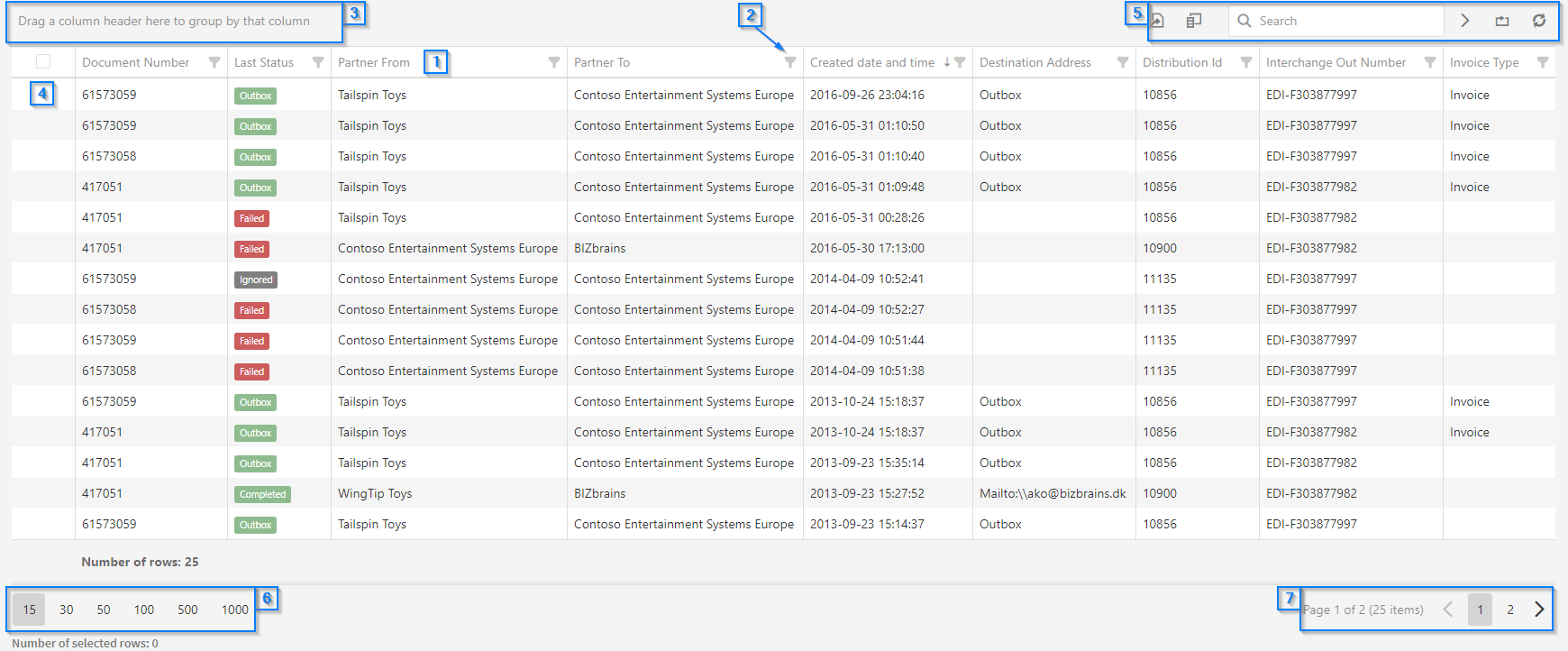
Sorting [1]
To sort the data, simply click on the column you wish to sort by. The first sorting done when clicked will be in ascending order. Click the column again to sort in descending order.
Filtering [2]
In order to exclude certain rows from the data grid you can make use of filtering. The filtering option is located to the right of the column name. By clicking it a window will appear, which show you the different values for the selected column. Click the checkbox next to the value to filter by it. 'Select All' will filter by all the values. See the animation below for further reference.
You can go back and change your filtering options, by clicking the filter icon again. To filter by more than one column, simply select the filter icon for each column you wish to filter by.
To reset the filtering, you can open the filtering options for each column and remove the checkboxes. Alternatively you can reset the entire data grid using the 'Reset' button, which is explained in the 'Data Handling' section on this page.
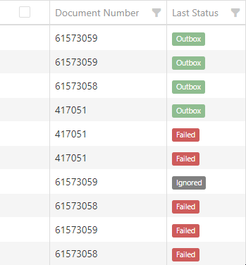
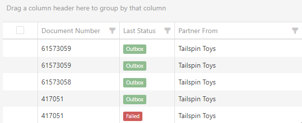
Grouping [3]
Organizing data in groups can help you get a quick overview of your data set. To group your data, drag the desired column into the small space above the data grid, where this text is displayed: "Drag a column header here to group by that column". See the animation below for further reference.
After you have dragged and released the column, a new window will appear, showing how many items match each group. In the example animation above, we have grouped by 'Last Status', which will group the items by their current status. Click the small arrow to the left to expand each group and see the individual items. You can sort the groups by clicking on the group header.
To add more groups, simply use the same drag and drop method as explained. Each group will then contain several subgroups depending on how many groups you selected. To return to the standard data grid, you can either drag the groups back onto the data grid, or click the 'Reset' button, which is explained in the 'Data Handling' section on this page.
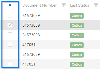
Select rows [4]
To select a row, tick the checkbox that appears when you hover your mouse over the blank field in the leftmost column. You can select multiple rows this way. Tick the topmost checkbox to select all rows. Note that this will select all rows on all pages. Tick the checkbox again to deselect the row. To deselect all rows, press the 'Reset' button as described in the 'Data Handling' section on this page.
Data Handling [5]
These options allow you to perform actions that affect the entire data grid. These will be further detailed below in order from left to right.
Export
Clicking the export button will present you with a dropdown of two options:
-
Export all data
-
Export selected rows
These allow you to either export the entire data grid as it is presented, or a specific set of rows. To select a row, click the empty checkbox in the furthest left column. You can deselect a row by clicking it again.
The data grid will be downloaded as an .xslt file, which can then be opened in an Excel program.
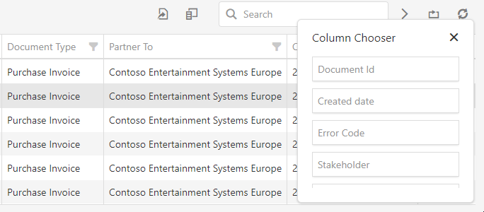
Column Chooser
This option makes it possible to customize which columns should be displayed in the data grid. Some columns are selected by default. When selecting it, you will be presented with a small window that contains all the columns that are not currently in use.
You can scroll while hovering your mouse over window box to see additional columns. To insert a new column you must drag it from the window to to the data grid. A blue line will appear when dragging, which means the column will be placed between the two columns. You can drag any column back to the window in the same manner. See the animation below for further reference.
Search
When data grids become too large, you may need to search for a specific item. The search box will perform its search on the entire data grid and will exclude the rows that do not match the search dynamically. Note that it is not possible to search for specific date and time intervals. Press the 'x' next to the search term to reset the search.
Reset
Clicking this will reset the state of the grid to the default state. This means that all current sorting, grouping, filtering etc. will be reset. If you have placed or removed any columns via the column chooser, these will be reset as well. Any currently selected rows will be deselected.
Collapse / Expand
Mangler tekst
Refresh
This will refresh the data grid, which may allow new documents to show up or remove ones that no longer meet the search criteria.
Items per page [6]
In the lower left corner you have the ability to select how many items that should de displayed on a single page. You can choose from 15 to 1000 items per page.
Pagination [7]
When you are dealing with a large amount of items, the data may need to be split up into several pages. Click the arrows to navigate between pages or click the page number to be taken to that page.
Horizontal Scrolling
You might encounter situations where you are unable to see certain data in columns that are not in view. To see this data, you can scroll the data grid horizontally as shown in the animation below.
Content on this page: